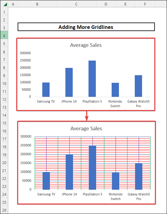
In order to make data more clearly visible, the importance of gridlines is immense. The gridlines in Excel are the lines present in horizontal and vertical directions that separate the cells. These gridlines help us to know the position of different cells and guide us to reach a particular cell. Gridlines can be added to charts as well. In this article, we will discuss the two ways by which we can add more gridlines to charts in Excel. We will also discuss removing gridlines from a chart and adding custom gridlines. An overview image of the ways in which we can add gridlines to charts is as follows.
📁 Download Excel File
Download the practice workbook below.
How to Add Gridlines to Excel
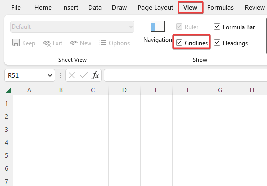
We can show or hide gridlines in Excel. To add gridlines in a worksheet in Excel, we have to go to the View tab and check the option named Gridlines. Checking the option will show gridlines in between our cells. This is illustrated by the image below.
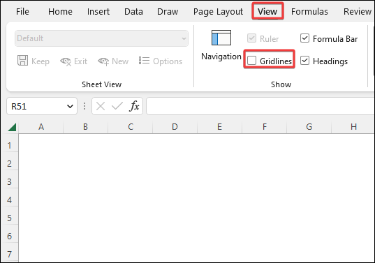
On the other hand, unchecking the gridlines will remove the grids from our worksheet. We can clearly understand it from the following image.
📕 Read More: 5 Ways to Add Gridlines After Highlighting in Excel
Learn to Add More Gridlines in Excel with Chart Elements Feature Using These 2 Approaches
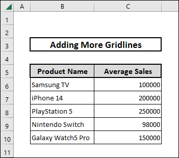
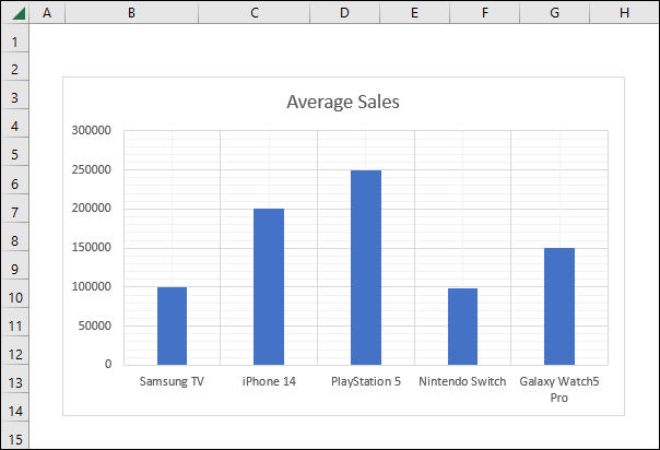
We can add gridlines in charts by using the Chart Elements feature. This feature can be accessed in two ways. We can access this feature by selecting the chart and then going to the Chart Design menu. On the other hand, we can also access the same feature by clicking the Plus (+) icon after selecting a chart. Using these two ways, we can add more gridlines in a chart to understand values more easily. To demonstrate things easily, we will consider a sample dataset where we have different product names and their average sales. We will use this data to create a column chart at first. Then we will add more gridlines to the generated chart. The sample dataset is shown as follows.
1. Utilizing Chart Elements Feature from Chart Design Menu
The Chart Elements feature allows us to modify the displayed chart. In this approach, we will access this feature from the Chart Design menu as the first step. Additionally, we will format the gridlines to make them prominently visible. The steps are explained as follows.
1.1 Adding More Gridlines
The first approach to accessing the Chart Elements feature is to select it from the Chart Design menu. This feature lets us manipulate the characteristics of the chart. The step-by-step procedure for this approach is as follows.
⬇️⬇️ STEPS ⬇️⬇️
- In the beginning, we select the entire dataset within the cell range B5:C10.
- After that, we go to the Insert tab.
- Then, from the Charts section, we click on Insert Column or Bar Chart and select the Clustered Column chart type from the 2D section.
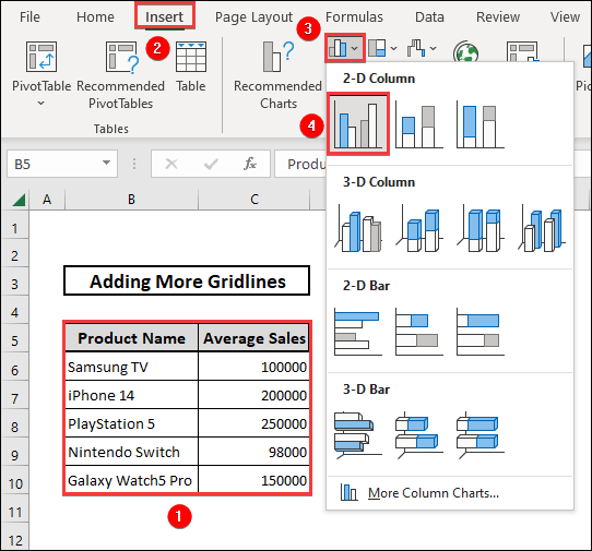
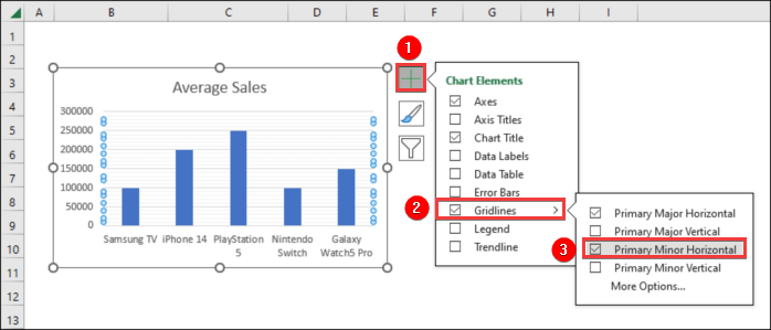
- A column chart will be created. We select the chart and move to the Chart Design menu.
- Then, we select the Add Chart Element option.
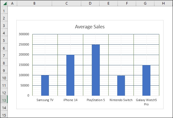
- We select the Primary Minor Horizontal option from the Gridlines section.
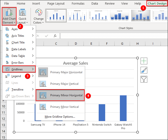
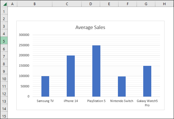
- We will see that aside from major horizontal lines, some smaller horizontal gridlines will also appear.
- Next, we follow the similar process. But this time, we select the option Primary Major Vertical after selecting Gridlines from the Add Chart Element option.
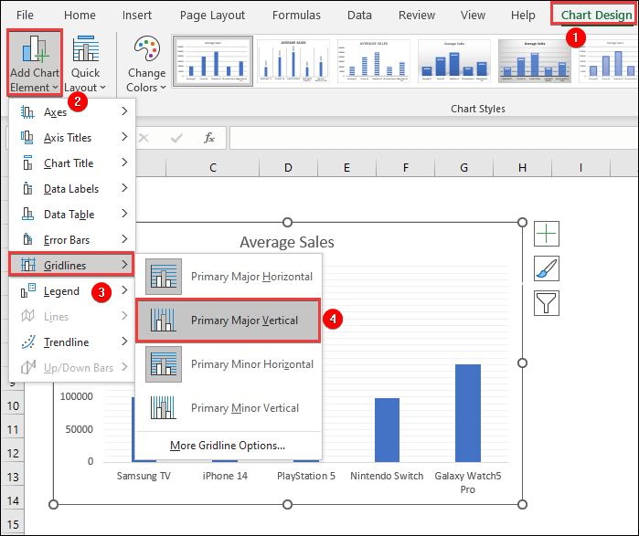
- We will see that more gridlines will appear within the already present horizontal gridlines.

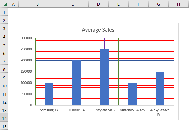
- Lastly, we select the Primary Minor Vertical option from the Gridlines portion of the Add Chart Elements option.
- This will make smaller vertical gridlines appear in the graph.
Thus, using these options, we can add more gridlines in Excel charts.
📕 Read More: 2 Approaches to Add Primary Minor Vertical Gridlines in Excel
1.2 Formatting Gridlines
The Primary Major and Primary Minor gridlines show lines that are often not very prominent. We can customize these gridlines according to our needs. The steps for formatting such gridlines are mentioned below.
⬇️⬇️ STEPS ⬇️⬇️
- We click on a Horizontal Major gridline and all of the Horizontal Major gridlines will be selected. We right-click and select the Format Gridlines option.
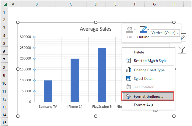
- A Format Major Gridlines named dialogue box will pop out at the right.
- Then, from the Fill and Line section, we go to the Color option.
- After that, we select a suitable color.
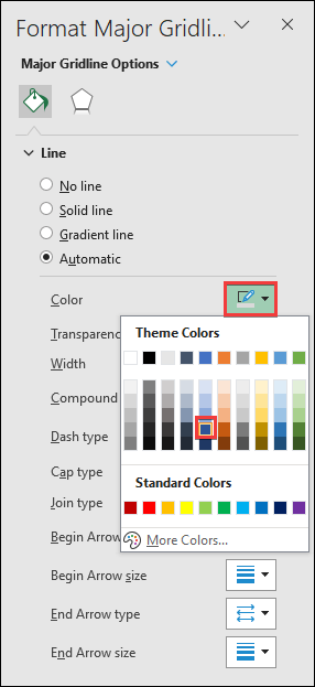
- After selecting a color, we will see that all the Horizontal gridline colors will change.

- Next, we select all the Vertical Major gridlines and pick a different color by going to the Format Gridlines option.
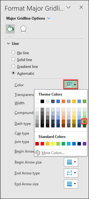
- We will see the Vertical Major Gridlines color will change.
- In this way, we change the colors of the Minor gridlines as well. The resultant output image will look like the following one.
2. Using Chart Elements Feature from Graph
This alternative approach is almost similar to the previous one. However, in this approach, we select the options by right-clicking the chart. The steps for this approach are as follows.
⬇️⬇️ STEPS ⬇️⬇️
- At first, we select the cell range B5:C10 and select the dataset.
- After that, we go to the Insert tab.
- Next, from the Charts section, we click on Insert Column or Bar Chart and select the Clustered Column chart type from the 2D section.

- A column chart will be created.
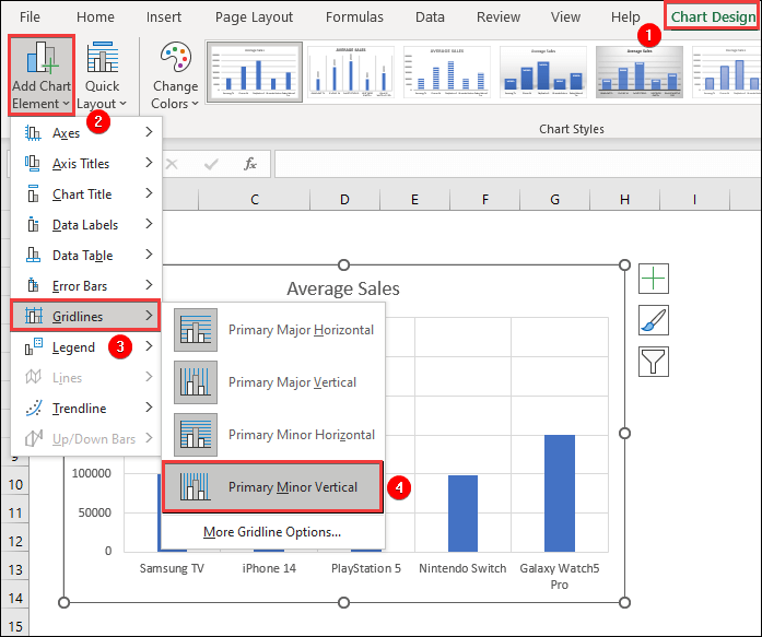
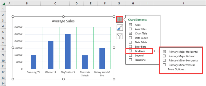
- Now, we select the chart and click on the Plus(+) sign on the top right portion of the chart.
- Different Chart Elements lists will be visible. In the Gridline checkbox, we select the right-pointed arrow and a list of options will appear.
- From the list, we select the Primary Minor Horizontal option.
- In this way, we select all four types of gridlines to make them visible.
- After that, we can format the gridlines by selecting them like it is mentioned in the previous approach.
- The ultimate result after formatting the gridlines will look like the following image.

How to Remove Gridlines from a Chart in Excel
To remove gridlines from the charts in Excel, we have to uncheck the gridline boxes. The steps for removing gridlines from charts in Excel are as follows.
⬇️⬇️ STEPS ⬇️⬇️
- At first, we select the chart.
- Then, we select the plus sign at the top right of the chart that denotes Chart Elements.
- If we want to remove all the gridlines, we uncheck the Gridlines box.
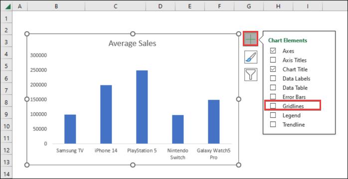
- On the other hand, if we want to remove any particular Major or Minor gridline, we uncheck that particular gridline option to remove it. One such instance of removing Primary Minor Horizontal and Vertical gridlines is shown below.
How to Add a Custom Line to a Chart in Excel
Sometimes, within a chart, we have to mark any specific lines to better represent the data we’re looking for. Hence, the use of custom lines marking a specific gridline can become essential. In this segment, we will look at how to add a custom line to a chart in Excel with the help of the following steps.
⬇️⬇️ STEPS ⬇️⬇️
- In the beginning, we create a chart using the sample dataset by inserting a 2D column chart. We do this by selecting cell range B6:C10 at first.
- Then, we go to the Insert tab and from the Charts section, we select a 2D column chart.

- A chart will be created using the selected data.
- Then, we create an additional table where the quantity of Sales is the desired value where we want to draw a line. Let us say, for this case, the value is 100000.
- We select the newly created table and copy the contents using the Ctrl+C shortcut.
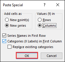
- Again, select the chart and go to the Paste Special option under the Home tab.
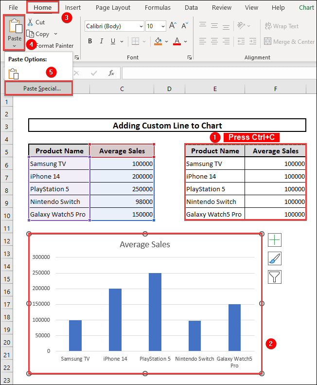
- A Paste Special box will appear. In the box, we select the New series option in Add cells as We check the Column option in the ‘Values (Y) in’ segment.
- Furthermore, we check the boxes named Series Names in First Row and Categories (X Labels) in First Column. At last, we press OK.
- The chart will look like the following image.
- Next, we select the chart, right-click, and select Change Chart Type.
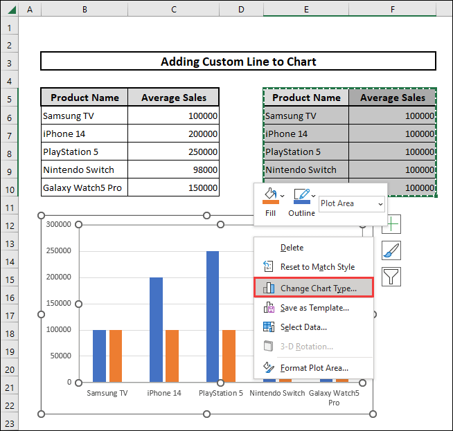
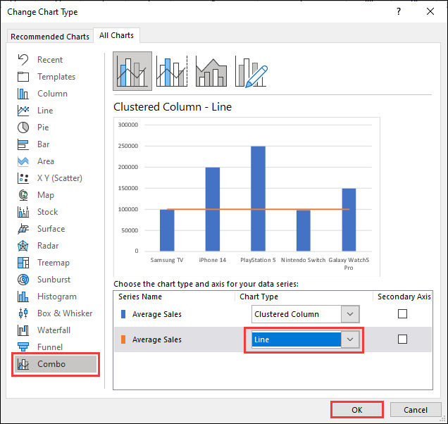
- In the new Change Chart Type window, we go to the Combo section.
- We select the series named Average Sales as a line chart and press OK.
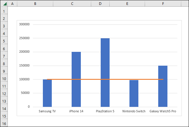
- We will see that a horizontal line in the value range of 100000 will be visible as the final output. The final output image will look like the image below.
How to Change Gridlines to Dash in Excel
In this particular segment, we will talk about the gridlines of cells, not charts. The gridlines present in between cells are usually solid in nature. To make the solid gridlines into dash, we need to change the border style. To do so, we follow these steps.
⬇️⬇️ STEPS ⬇️⬇️
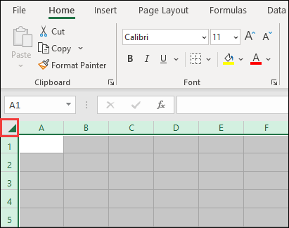
- At first, we select the entire worksheet by either pressing the shortcut Ctrl+A or by tapping on the triangle in the top left corner of the worksheet.
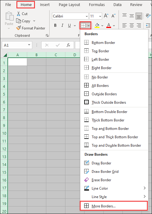
- In the Home tab, under the Font section, we click on Borders and select More Borders.
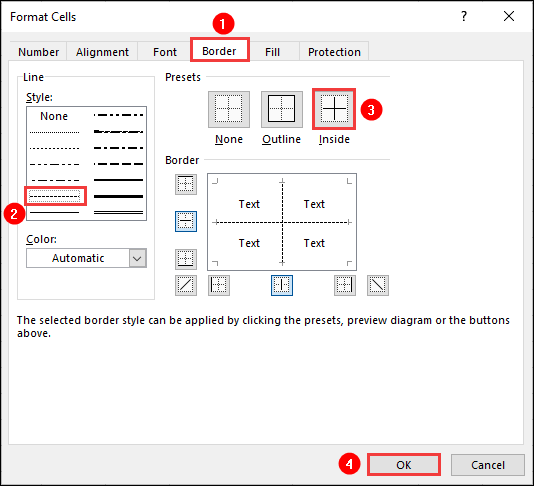
- A Format Cells window will appear.
- In the Style category under the Border section of Format Cells, we select the dash line.
- We click on the Inside option under the Presets category and press OK.
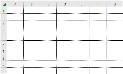
- As a result, the solid gridlines will change into dashed gridlines like the following image.
📄 Important Notes
🖊️ We can insert a basic chart easily by selecting the data and pressing the shortcut Alt+F1.
🖊️ In case of adding a line in an Excel chart, we should be careful in selecting the dataset along with headers. Then after selecting the chart and going to the Paste Special box, we should check the option named Series Names in First Row. Otherwise, the line will not be continuous.
📝 Takeaways from This Article
You have taken the following summed-up inputs from the article.
📌 Adding and formatting gridlines in Excel charts can be done using Chart Elements feature which can be accessed in two ways.
📌 We can remove gridlines by unchecking the different Major and Minor lines from the Chart Elements section.
📌 Additionally, we can add a specific line in a chart in Excel by introducing another chart and converting it into a line chart by changing the chart type.
📌 The gridlines present in cells can be modified by changing the border type.
Conclusion
To conclude, I hope that this article has helped you to understand how to add more gridlines and also some additional procedures involving gridlines in Excel. If you have any queries, reach out to us by leaving a comment below. Follow our website ExcelDen for more informative articles related to Excel.